
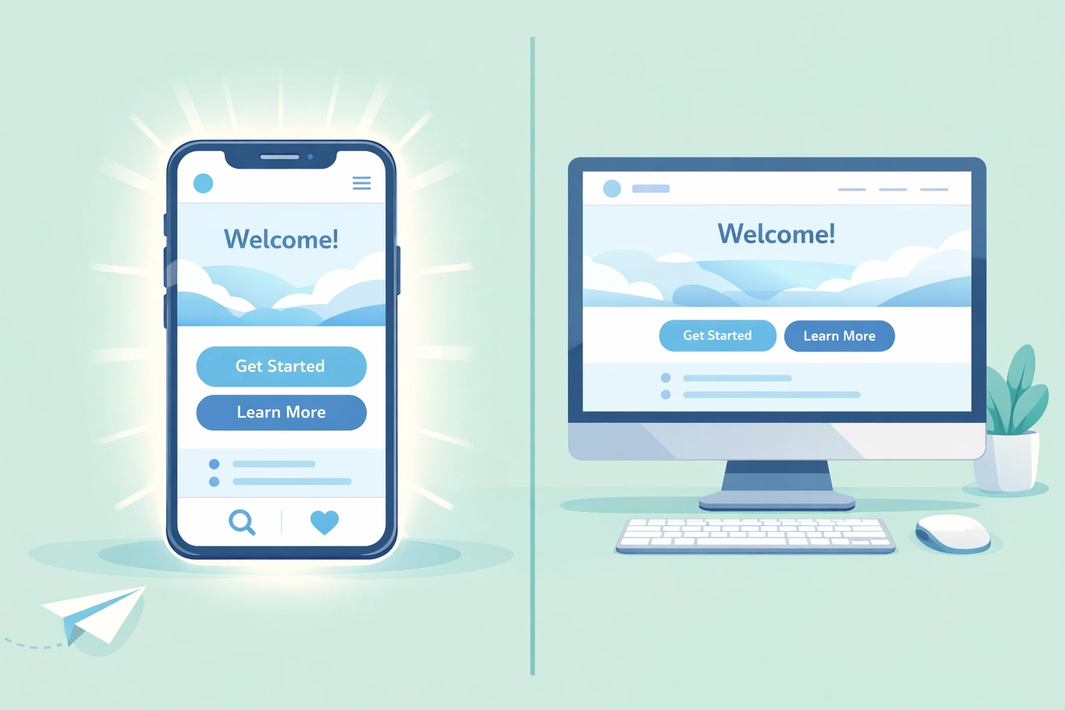
You spent good money on that website. Maybe someone told you it looked "professional." But here's the brutal truth: if tourists can't book your Venice charter boat on their phone from the beach, or locals can't find your Sarasota restaurant's menu while driving down Tamiami Trail, you're losing sales. Every. Single. Day.
More than 60% of your website visitors are on their phones. Here in Southwest Florida, that number's probably higher: think about how many snowbirds and tourists are searching for businesses on their mobile devices while exploring Venice Island or walking down Venice Avenue.
Yet we see it constantly: beautiful desktop websites that turn into absolute nightmares on mobile. And it's costing Venice businesses real money.
Let's fix that. Here are the seven mobile-first design mistakes that are killing your conversions: and what to do about them.
1. You're Still Designing Desktop-First (Then "Adapting" for Mobile)
This is the biggest mistake, and it's everywhere.
You worked with a designer who showed you gorgeous desktop mockups. Everything looked perfect on their big monitor. Then they "made it responsive": which really means they tried to cram that desktop design into a phone screen.
The result? Tiny buttons. Confusing navigation. Content that doesn't make sense on a small screen.
Mobile-first means exactly that: design for phones first, then expand to tablets and desktops. Not the other way around. When you start with mobile constraints, you're forced to prioritize what actually matters to your customers. No room for fluff. No space for that giant hero slider that looked cool but nobody cares about.
Here in Venice, your potential customers are searching for you while they're out and about. They need information fast. Mobile-first design respects that reality.
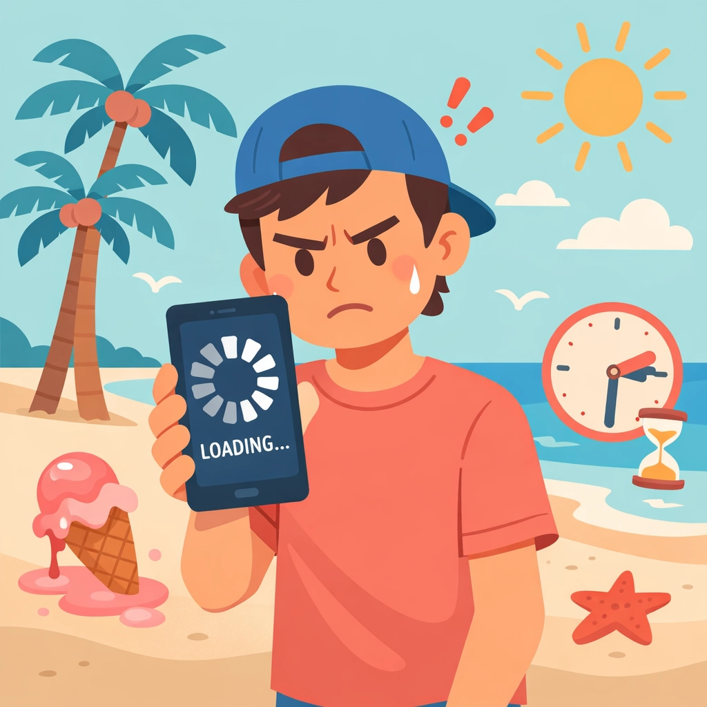
2. Your Site Loads Slower Than Afternoon Traffic on I-75
You know that frustration of sitting in traffic on I-75 during season? That's exactly how your customers feel waiting for your slow website to load.
If your site takes more than 3 seconds to load on mobile, you've already lost half your visitors. They're gone. Clicked back. Found your competitor instead.
The culprits are usually:
- Massive, uncompressed images (that 4MB photo of your storefront)
- Videos that auto-play and aren't optimized
- Clunky website builders with bloated code
- Too many plugins and third-party scripts
The fix: Compress every image before uploading it. Use modern image formats. Lazy-load images below the fold. If you're not sure how to do this yourself, it's worth having someone who knows what they're doing take a look. Speed isn't just nice to have: it's essential.
3. Your Buttons Are Impossible to Tap
Picture this: A tourist is sitting outside Sharky's on the beach, phone in one hand, drink in the other, trying to book a fishing charter. They tap your "Book Now" button three times. Nothing happens. They give up.
You just lost a $500 booking because your button was 28 pixels tall.
Minimum button size for mobile: 44×44 pixels. That's not a suggestion: it's based on the average size of human fingertips. And here's something most designers miss: 75% of people browse with their thumb. Put your important buttons and links where thumbs naturally rest.
This applies to:
- Call buttons
- "Get Directions" links
- Booking forms
- Menu items
- Shopping cart buttons
Make it easy. Make it thumb-friendly. Make it tappable on the first try.
4. Your Navigation Is a Confusing Mess
Drop-down menus with 47 options. Hamburger menus that hide everything important. Navigation that disappears when you scroll.
Stop it.
Your mobile navigation should be:
- Sticky at the top (always visible)
- Simple (5-7 main options max)
- Clearly labeled (if you use a hamburger menu, label it "Menu")
- Touch-friendly (see point #3)
Think about what your Venice customers actually need to find quickly:
- Hours and location
- Services or menu
- Contact/book now
- Directions
Everything else is secondary. Your navigation should reflect that priority: especially on mobile.
5. Your Most Important Content Is Buried
You've got your phone number hidden in the footer. Your "Book Now" button is after three paragraphs of company history. Your restaurant's hours are on a separate "About" page.
Meanwhile, someone's sitting in their car on Venice Avenue trying to figure out if you're open. They can't find the answer in 5 seconds, so they drive to your competitor instead.
Content priority on mobile matters. The most important information should be above the fold: that's the part of the screen visible without scrolling.
For most Venice businesses, that means:
- What you do (immediately clear)
- Your phone number (clickable to call)
- Location and hours
- Primary call-to-action
Your brand story? That can wait. Give people what they need first.
6. Your Images and Media Are Crushing Performance
That beautiful photo gallery of your Venice property? The one with 24 high-resolution images? It's destroying your mobile experience.
And that video background on your homepage? Looks great on desktop. On mobile, it's:
- Eating up data
- Slowing load times
- Probably not even visible on most phones
Optimize everything:
- Resize images to actual display size before uploading
- Compress without losing quality
- Use modern formats (WebP when possible)
- Embed videos from YouTube or Vimeo instead of hosting them
- Skip auto-play videos entirely on mobile
Remember: Many tourists are on limited data plans. Locals are often on the go. Heavy media files aren't just slow: they're expensive for your users.

7. You're Not Actually Testing on Real Phones
Here's a common scenario: Your web developer says "I tested it in Chrome's mobile view: looks great!"
That's not the same as testing on actual phones. Not even close.
Different devices behave differently. iOS and Android render things differently. What looks perfect in a desktop browser's mobile simulator can be completely broken on an actual Samsung Galaxy or iPhone.
Test on real devices:
- iPhones (multiple sizes if possible)
- Android phones (Samsung, Google Pixel)
- Tablets in both orientations
- Different browsers (Safari, Chrome, Firefox)
Ask friends, employees, and customers to test. Watch where they struggle. Fix those pain points.
And keep testing. Every time you update your site. Every time you add new content. Mobile isn't "set it and forget it."
The Venice Reality Check
Here in Venice and throughout Southwest Florida, mobile traffic isn't just a majority: it's dominant. Snowbirds researching restaurants from their condo. Tourists looking for activities while sitting on Caspersen Beach. Locals finding services while running errands.
Your website needs to work flawlessly for all of them. On every device. Every time.
These seven mistakes aren't just technical problems: they're money walking out the door. Every slow page load is a lost customer. Every difficult-to-tap button is a missed booking. Every buried piece of information is someone choosing your competitor.
The good news? These are fixable. Most don't require a complete website rebuild. They require attention, testing, and a genuine commitment to mobile-first thinking.
At Island Marketing, we see these issues constantly with Venice businesses. And we see what happens when they're fixed: traffic increases, bounce rates drop, and most importantly, phones start ringing and forms start getting filled out.
Want us to take a look at your mobile experience? Sometimes you're too close to your own website to see what's broken. We'd be happy to give you an honest assessment of where you stand and what quick wins could make the biggest difference.
Because your website shouldn't be killing sales. It should be your hardest-working salesperson: especially on mobile, where most of your customers are looking for you right now.
