
You’ve built an incredible business here in South West Florida. Whether you’re running a boutique on Venice Avenue, a landscaping crew in North Port, or a cozy cafe in Sarasota, you know your craft inside and out. You’ve mastered the art of local service. But here’s the cold, hard truth: if your website doesn't look, and work, perfectly on a smartphone, you’re essentially locking your front door to half of your potential customers.
The digital world has changed more in the last year than it did in the previous decade. We’ve moved past the point where having a "mobile version" of your site was a nice bonus. Today, mobile-friendly design is the foundation of your entire digital presence.
At Island Marketing, we see it every day. Local business owners are frustrated. You’re excellent at what you do, but the tech jargon is overwhelming. You hear about "responsive design," "load speeds," and "indexing," and it feels like a second full-time job just to keep up. We believe it shouldn't be that hard. You deserve a website that works as hard as you do, especially in a market as unique as ours.
Here are the 5 trends currently shaping how South West Florida small businesses need to approach mobile design to stay competitive in 2026.
1. The Death of the Desktop-First Mindset
For years, the standard way to build a website was to design it for a large computer screen and then "shrink it down" for phones. We’re telling you right now: that approach is dead.
In South West Florida, our audience is mobile by nature. Think about it. We have tourists navigating the Tamiami Trail looking for lunch. We have remote workers sitting at a coffee shop in Wellen Park. We have retirees checking service reviews while waiting for an appointment. If your site was built for a 27-inch monitor first, it’s going to feel clunky and awkward on a 6-inch screen.
The Mobile-First Approach means we flip the script. We design for the smallest screen first, focusing on what’s most important, and then scale up for desktops. This ensures the experience is streamlined, the most vital information (like your phone number and location) is front and center, and the user doesn't have to "pinch and zoom" just to read your menu or service list.

2. Is Your Site Fast Enough for a Florida Summer?
We’ve all been there. You’re trying to look something up while out in the sun, the glare is hitting your screen, and the website just… won’t… load. You give it about three seconds before you hit the back button and click on the next business in the search results.
Speed is a competitive advantage. In 2026, mobile users expect instant gratification. If your site takes more than a couple of seconds to load on a 5G or (heaven forbid) a spotty LTE connection near the beach, you’ve lost them.
Fast, mobile-first sites aren’t just about being polite; they’re about survival. Google knows that users hate waiting, so they reward fast sites with better rankings. We focus on optimizing images, cleaning up messy code, and using local hosting to ensure that when someone in Venice clicks your link, your site pops up before they can even take a sip of their iced tea.
Stop Wasting Seconds:
- Optimize every single image before uploading.
- Minimize the use of heavy "flashy" animations that slow things down.
- Use "Lazy Loading" so the top of the page appears instantly.
3. Solving the 'Fat Finger' Problem with Touch-Friendly Layouts
The jargon is overwhelming, but the problem is simple: can someone actually click your buttons?
We’ve all visited sites where the "Contact Us" button is so tiny you end up clicking the "Privacy Policy" link next to it three times in a row. It’s infuriating. In a region like ours, where a significant portion of our demographic might be dealing with vision changes or just prefers a simpler interface, touch-friendly design is non-negotiable.
A modern, mobile-friendly site uses "thumb-friendly" navigation. This means putting the most important buttons within easy reach of a user's thumb at the bottom or middle of the screen. It means using large, readable fonts and ensuring there is enough "white space" between links so people don't misclick.
We believe that technology should serve personal service, not replace it. By making your site easy to navigate, you’re showing your customers that you value their time and their ease of use.

4. Google’s "Mobile-First Indexing" is the Only Rule That Matters
You might have the most beautiful desktop website in all of Sarasota County, but if the mobile version is lacking, Google might behave as if your site doesn't exist at all.
For a while now, Google has been using "Mobile-First Indexing." This means their "crawlers" (the little digital robots that rank your site) look at your mobile site first to determine where you should show up in search results. If your mobile site is missing content that your desktop site has, or if it’s slow and hard to use, your rankings will tank.
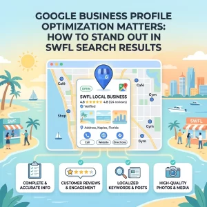
This is especially critical for Local SEO. When someone searches "Plumber near me" or "Best seafood in Venice," Google is looking for the best mobile experience to give that user. If your competitor has a snappy, mobile-optimized site and you don’t, they get the call. It’s as simple as that.
Watch Your Business Grow by aligning with what Google wants:
- A consistent experience across all devices.
- High-quality, readable text without zooming.
- No intrusive pop-ups that cover the whole mobile screen (Google hates those!).
5. From Browsers to Buyers: Conversion-Focused Design
At the end of the day, your website isn't an art project, it’s a business tool. We want to turn those "browsers" into "buyers."
On a mobile device, the "path to purchase" needs to be as short as possible. If a customer has to fill out a 10-field form on their phone to get a quote, they’re going to quit halfway through. Modern trends are moving toward:
- One-tap calling: Making your phone number a button that starts a call instantly.
- Simplified forms: Only asking for the essentials (Name, Phone, Email).
- Mobile payments: Integrating Apple Pay or Google Pay for local retail or service deposits.
By reducing the friction, that annoying resistance people feel when trying to do something online, you make it easy for them to say "yes" to your business.

The Bridge Between Old and New
The landscape of South West Florida business is changing. We’re seeing a shift where the "old way" of doing things: relying solely on word of mouth or a static, 10-year-old website: is no longer enough to keep the doors open. But you don't have to be a tech genius to bridge the gap.
We see Island Marketing as that bridge. We understand the local vibe of Venice and the surrounding areas because we live here too. We know that you want to provide that "small town" feel while utilizing "big city" technology.
"Traffic & Leads Up" : that’s the outcome we aim for. When your website is optimized for mobile, you aren't just following a trend; you're future-proofing your livelihood. You’re making sure that as Venice grows and more people move to our beautiful corner of Florida, your business is the one they find, trust, and contact.
Stop Wasting Your Digital Potential
If you’re sitting there thinking, "I haven't looked at my own website on my phone in months," now is the time. Open it up. Try to find your phone number. Try to read your services. If it feels like a struggle, it’s a struggle for your customers too.
The good news? It doesn't have to stay that way. The shift to a mobile-first world is an opportunity to leapfrog your competitors who are still "figuring it out."
Let’s get your business future-ready.
We believe that your expertise in your craft is what makes your business special. Our expertise is making sure the rest of South West Florida knows it.
Schedule a Call → We’ll assess your current mobile presence and show you exactly where the gaps are. No jargon, no pressure: just a local partner helping you navigate the modern web.

Building a mobile-friendly site is about more than just code; it’s about connection. In a world that’s increasingly digital, let’s make sure your business remains human, accessible, and ready to serve. Check back next week as we dive deeper into local SEO strategies specifically for Venice and Sarasota small businesses!